# A tibble: 537 × 15
     id arm   sex     age bmicat  qol_0 qol_3  qol_6  qol_12 qol_18 qol_24 gpvis
  <int> <fct> <fct> <int> <fct>   <dbl> <dbl>  <dbl>   <dbl>  <dbl>  <dbl> <int>
1     1 0     1        57 1      0.883  1     NA      1      NA      1         2
2     2 0     1        66 1      0.0880 0.848  0.689  0.0880  0.691  0.587    21
3     3 0     2        57 1      0.796  0.796  0.796  0.62    0.796  1         5
4     4 0     2        49 2      0.725  0.727  0.796  0.848   0.796  0.291     5
5     5 0     2        64 2      0.850  0.796  0.796 NA      NA     NA         5
# ℹ 532 more rows
# ℹ 3 more variables: costint <dbl>, costoth <dbl>, totalcost <dbl>5 Individual level data
Mi Jun Keng
University of Oxford, UK
Iryna Schlackow
University of Oxford, UK
Eleanor Pullenayegum
Sick Kids Hospital and University of Toronto, Canada
5.1 Introduction
Analysis using individual patient data comes with the benefits afforded by the type of analysis that can be performed, and the ability to capture patient heterogeneity. However, there are practical and methodological challenges involved. Practically, there could be issues with privacy, storage, and computational power required for handling and analysing large datasets. Methodological challenges include handling of missing data, choice of models to use for analysis etc.
Data pre-processing is a critical component of data analysis, and is typically needed to derive variables of interest required for analysis. It is unfortunately not always straight-forward, and can be time-consuming. For example, one may need to derive healthcare cost from records of prescriptions, GP visits and hospital visits, and these records may need to be extracted from different databases, which may all use different coding systems.
Data exploration is then needed to help understand the structure of the data, identify outliers, understand relationship between variables etc. which subsequently informs how your research question can be addressed (e.g. what models to use given data distribution).
In this chapter, we will demonstrate how to
- manipulate datasets and construct key variables for analysis
- summarise data; perform descriptive analysis
- perform frequentist cost-effectiveness analysis
- perform Bayesian cost-effectiveness analysis
NotePackages used in this chapter
This chapter mainly uses the dplyr package with magrittr “forward pipe” %>% for data manipulation. These, amongst other packages, form the tidyverse collection, an opinionanted collection of R packages, sharing an underlying grammar for data science. For a more in-depth tutorial, we refer users to Wickham et al. (2023). From R version 4.1.0 onward, a “native pipe” |> has been added to base R, and can be used instead of %>%, without relying on the dependency to magrittr.
5.2 Case study: the 10 Top Tips trial
WarningDisclaimer
In this chapter, we will demonstrate the process of performing a within-trial cost-utility analysis using a simplified, synthetic dataset 10TT_synth_280921.csv generated based on the Ten Top Tips (10TT) trial design (Beeken et al., 2017). This merely serves as a case study to illustrate the concepts of using individual patient data for analysis so methods and results may deviate from the published within-trial cost-effectiveness analysis of the trial (Patel et al., 2018).
The 10TT trial was a two-arm, individually randomised, controlled trial of a weight-loss intervention for obese adults attending general practices in the UK. 537 participants in the trial were randomised to receive either the 10TT intervention, or usual care from their general practices. The intervention was designed to encourage forming of good habits through self-help materials including a leaflet with ten simple weight-control tips and a logbook to record participant’s own progress.
Each row of data (stored in an R object named df, for which we show below the first few below) corresponds to a participant in the trial, with participant’s ID id, treatment arm arm (1 for 10TT arm, 0 for usual care), and baseline characteristics including sex (1 for Male, 2 for Female), age, and BMI category (bmicat: 1 for < 35kg/m\(^2\), 2 for \(\ge\) 35kg/m\(^2\)). Additionally, there is quality of life data collected at baseline and during follow-up (qol_k, where k is the month of collection), the number of GP visits (gpvis), cost of intervention (costint), cost of other healthcare resource use such as secondary care and practice nurse visits (costoth), as well as total cost totalcost.
We will perform a within-trial cost-utility analysis to compare the costs and outcomes (i.e. QALYs see Chapter 1) associated with 10TT and usual care. The primary outcomes are incremental costs and effects and the incremental net monetary benefit (NMB) of 10TT versus usual care over the 2-year trial follow-up period. Because of the short duration of the trial, no discounting will be applied. We consider cost-effectiveness thresholds of £20,000/QALY and £30,000/QALY. For the purpose of this chapter, we will be performing a complete case analysis so missing data will be excluded (more details on handling of missing data is available in Chapter 6).
5.2.1 Descriptive statistics
We first start by producing descriptive statistics for the dataset. This can include sample size, measures of central tendancy (mean, median, mode), measures of variability (standard deviation, variance), dispersion of data (minimum, maximum, interquatile range), shape of distribution of data (skewness, kurtosis), and measures of dependence between variables (correlation, covariance). These can be presented as summary values in tabular form (typically “Table 1” in health research publications), or visualised graphically using histograms for example. Descriptive statistics are helpful to understand for example how your data is distributed, imbalances between treatment arms etc. which ultimately informs the analysis (choice of model to use or variables to include in model) and interpretation of results.
It is possible to use base R or tidyverse to produce descriptive statistics, which gives you maximum control over how you want to summarise and present the data. There are also many packages that can help you do this (varying in ease of use and flexibility for customisation), including: qwraps2, tableone, DescTools.
Baseline demographics
Here, we summarise the participants’ demographics at baseline, using the CreateTableOne function from the R package tableone.
tableone::CreateTableOne(
  vars = c("sex", "age", "bmicat"), strata = "arm", data = df, test = F
)
Stratified by arm
0 1
n 272 265
sex = 2 (%) 184 (67.6) 182 (68.7)
age (mean (SD)) 56.71 (13.06) 56.05 (12.39)
bmicat = 2 (%) 130 (47.8) 145 (54.7)
Note
In this dataset, categorical variables were coded in numerical values by default. This may be useful when you have a reference level in mind or for variables with natural ordering (e.g. from low to high BMI), since numerical values have natural ordering. However, note that for regression analyses, numerical values are treated as continuous variables if not factorised. It is thus useful to check the type (e.g. numeric, character, factor) of each variable when the dataset is first imported, and factorise categorical variables where necessary. Sometimes, it might be more intuitive to have labels instead of numerical values. The levels are ordered alpha-numerically by default, but it is possible to specify your own order for the levels. This can be changed accordingly in the data frame, which we will demonstrate with the arm variable in the dataset.
## Create new data frame df_label for demonstration
df_label <- df

## Factorise treatment arm variable
## Assign labels and order to respective levels
df_label$arm <- factor(
  df_label$arm, levels = c("1", "0"),
  labels = c("10TT", "Usual Care"), ordered = T
)

tableone::CreateTableOne(
  vars = c("sex", "age", "bmicat"), strata = "arm",
  data = df_label, test = F
)
Stratified by arm
10TT Usual Care
n 265 272
sex = 2 (%) 182 (68.7) 184 (67.6)
age (mean (SD)) 56.05 (12.39) 56.71 (13.06)
bmicat = 2 (%) 145 (54.7) 130 (47.8) Utilities & QALYs
Participants completed the EQ-5D-3L questionnaire (Rabin and de Charro, 2001) during study visits at baseline, and at 3, 6, 12, 18 and 24 months. These responses were mapped onto utility scores based on the UK tariffs — labelled qol_k, where k is the month of measurement (Dolan, 1997).
We can use the following R code to transform the data from “wide” to “long” format using the dplyr function pivot_longer and then ggplot to create the actual plot of the mean quality of life (QoL) at each study visit, stratified by treatment arms.
df_qol <- df %>%
  ## select columns of interest
  select(id, arm, contains("qol")) %>%
  ## convert dataframe from wide to long format
  pivot_longer(
    contains("qol"), names_to = "month", names_prefix = "qol_",
    names_transform = list(month = as.integer), values_to = "qol"
  )

df_qol %>%
  ## group by treatment arm and month
  group_by(arm, month) %>%
  ## calculate mean and standard error by treatment arm and month
  summarise(
    qol_mean = mean(qol, na.rm = T),
    qol_se = sqrt(var(qol, na.rm = T)/length(qol))
  ) %>%
  ## Applies 'ggplot' to this dataset
  ggplot(aes(color = arm, group = arm)) +
  ## add data points and error bars
  geom_point(aes(x = month, y = qol_mean, shape = arm)) +
  geom_errorbar(
    aes(x = month, ymin = qol_mean - 1.96 * qol_se,
        ymax = qol_mean + 1.96 * qol_se)
  ) +
  ## add lines to connect points
  geom_line(aes(x = month, y = qol_mean, group = arm, linetype = arm)) +
  ## add labels and break points for axes
  labs(x = "Month", y = "Mean QoL at each study visit (95% CI)") +
  scale_x_continuous(breaks = c(0, 3, 6, 12, 18, 24))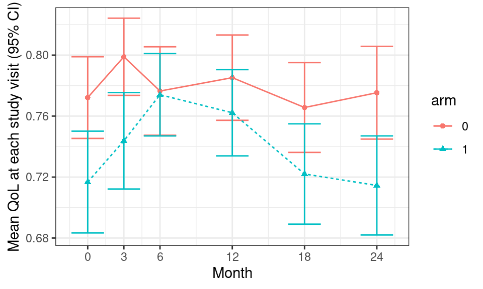
NoteDiscounting
Since the trial had a relatively short duration (2 years), no discounting was applied for the analysis. However, discounting is typically required. Here, we demonstrate an example if we were to apply a 3.5% discount rate to quality of life data by pre-defining a function disc to perform discounting.
## Function to perform discounting. Default discount rate set at 3.5%
disc <- function(x, year, disc_rate = 0.035) {
  x / ((1 + disc_rate)^(year - 1))
}

## Apply discounting to QoL data
df_qol_disc <- df_qol %>%
  ## convert month to follow-up year; set baseline to be in year 1
  mutate(year = pmax(1, ceiling(month/12))) %>%
  ## apply discounting
  mutate(qol_disc = disc(qol, year))

## Example of QoL data for participant id 3
df_qol_disc %>%
  dplyr::filter(id == 3)
# A tibble: 6 × 6
id arm month qol year qol_disc
<int> <fct> <int> <dbl> <dbl> <dbl>
1 3 0 0 0.796 1 0.796
2 3 0 3 0.796 1 0.796
3 3 0 6 0.796 1 0.796
4 3 0 12 0.62 1 0.62
5 3 0 18 0.796 2 0.769
6 3 0 24 1 2 0.966A utility profile was constructed for participants assuming a straight-line relation between their utility values at each measurement point. QALYs for every patient from baseline to 2 years were calculated as the area under the utility profile. For example, Figure 5.1 shows the curve for the participant associated with ID=3.
## Plot QoL data over time for participant id 3
ggplot(data = df_qol %>% dplyr::filter(id == 3)) +
  geom_line(aes(x = month, y = qol)) +
  ## add shading below line
  geom_ribbon(
    aes(x = month, ymax = qol, ymin = 0), fill = "red", alpha = 0.2
  ) +
  ## add labels and break points for axes
  labs(x = "Month", y = "QoL") +
  scale_x_continuous(breaks = c(0, 3, 6, 12, 18, 24))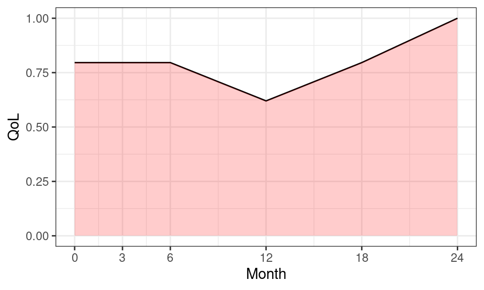
We can also compute overall summary statistics to describe the distribution of QALYs for all patients, using the following code.
df_qaly <- df_qol %>%
  ## group data by participant id, and subsequent manipulation
  ## is done for each participant
  group_by(id) %>%
  ## exclude participants with missing qol at any visit
  dplyr::filter(!any(is.na(qol))) %>%
  ## calculate area under the utility profile (using DescTools::AUC)
  summarise(
    qaly = DescTools::AUC(x = month, y = qol, method = "trapezoid") / 12
  )
summary(df_qaly$qaly)
Min. 1st Qu. Median Mean 3rd Qu. Max.
-0.05738 1.36400 1.61288 1.56824 1.88300 2.00000 We construct a dataset of quality of life data to use for subsequent analysis, by “pivoting” the original data to a “wide” format — instead of having replicated rows for each individual with data at different time points, we “flip” the data table around so that each row indicates a single individual, with multiple columns indicating the various time points. We do this using the pivot_wider command from the R package dplyr.
df_qol_analysis <- df_qol %>%
  select(id, month, qol) %>%
  ## convert dataframe from long to wide format
  pivot_wider(
    names_from = "month", values_from = "qol", names_prefix = "qol_"
  ) %>%
  ## merge with qalys calculated before
  left_join(df_qaly, by = "id")
Resource use and costs
Data on healthcare resource use were extracted from general practitioner (GP) records over the 2-year study period, and costs were measured from a healthcare perspective. These include cost of GP visits (number of GP visits gpvis \(\times\) £45/GP visit), cost of intervention (costint £22.90 for 10TT intervention), and cost of other healthcare resource use such as secondary care and practice nurse visits (costoth).
We construct a dataset of cost data to use for subsequent analysis, by selecting the individuals and their total cost (as given in the variable totalcost, which we then ename to cost).
## Example of cost data
df_cost_analysis <- df %>%
  select(id, totalcost) %>%
  rename(cost = totalcost)
Note that the original dataset already contains the variable totalcost. We can do a quick check to see if this has been calculated correctly using the following R code.
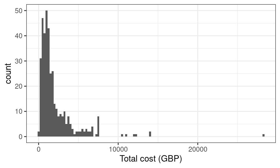
all.equal(df$gpvis * 45 + df$costint + df$costoth, df$totalcost)[1] TRUEWe can plot a histogram to visualise the distribution of total cost. From the histogram, we see that the data is bounded below by zero and heavily skewed with long right hand tail, which are features typical of cost data.
Analysis dataset
We now combine the datasets on patient characteristics df, cost df_cost_analysis and quality of life df_qol_analysis for further analysis1. We tabulate the number of participants with missing data, who will then be excluded in subsequent analyses.
df_analysis_withmissing <- df %>%
  ## create a dataframe with baseline characteristics
  select(id, arm, sex, age, bmicat) %>%
  ## merge quality of life data
  left_join(df_qol_analysis, by = "id") %>%
  ## merge cost data
  left_join(df_cost_analysis, by = "id")

# Checks for missing data
df_analysis_withmissing %>%
  summarise(across(c("qaly", "cost"), ~ sum(is.na(.))))
qaly cost
1 369 153After excluding participants with missing data, 167 participants (31%) are included in our analysis, with 67 and 100 participants in the 10TT and usual care arms respectively.
df_analysis <- df_analysis_withmissing %>%
  drop_na()

tableone::CreateTableOne(
  strata = "arm", data = df_analysis %>% select(-id), test = F
)
Stratified by arm
0 1
n 100 67
arm = 1 (%) 0 ( 0.0) 67 (100.0)
sex = 2 (%) 65 (65.0) 50 ( 74.6)
age (mean (SD)) 58.61 (11.24) 59.24 (11.02)
bmicat = 2 (%) 43 (43.0) 35 ( 52.2)
qol_0 (mean (SD)) 0.78 (0.24) 0.73 (0.26)
qol_3 (mean (SD)) 0.82 (0.18) 0.76 (0.23)
qol_6 (mean (SD)) 0.80 (0.24) 0.80 (0.21)
qol_12 (mean (SD)) 0.80 (0.25) 0.77 (0.24)
qol_18 (mean (SD)) 0.79 (0.24) 0.75 (0.25)
qol_24 (mean (SD)) 0.80 (0.24) 0.72 (0.24)
qaly (mean (SD)) 1.60 (0.39) 1.52 (0.40)
cost (mean (SD)) 1557.39 (1340.96) 2647.37 (3293.94)We can now visualise the distribution of cost and QALYs by treatment arm in Figure 5.2.

5.3 Maximum likelihood estimation
In this section, a cost-utility analysis is undertaken, comparing the costs and outcomes (i.e. QALYs) associated with 10TT versus usual care under a “standard” likelihood/frequentist approach (see Chapter 4 for a structured discussion of the main philosophies and issues underpinning statistical modelling). The primary outcomes are incremental costs and effects and the incremental net monetary benefit (NMB) of 101TT versus usual care at 2 years, as per trial follow-up. No extrapolation is undertaken, and cost-effectiveness thresholds of £20,000/QALY and £30,000/QALY are being considered.
5.3.1 Cost and utility equations
Following Patel et al. (2018), we will compare differences in mean costs and utilities using linear regression models (Section 4.6.2) relating participants’ outcomes of interest (i.e. costs or change in QALYs at 2 years) with important variables.
Linear regressions (see Section 4.6.2) can be fitted in R using the lm command, which takes an object of class formula as a compulsory argument. The formula may contain variables themselves, or, if these come from a dataset, column names, with the dataset specified as an (optional) df argument.
Further details describing the use of the lm command, including possible arguments, output values as well as references to the topic of linear regression in general, can be found on the lm help webpage.
For the simplest scenario, let us start with unadjusted models, i.e. regress participants’ outcomes of interest on their treatment arm only. First, the lm command will be used to check for differences across the trial arms. Since the participants’ costs and trial arm assignment are recorded in the df_analysis dataset, formula arguments will be written as column names:
# run model regressing cost on the trial arm
m_cost <- lm(cost ~ arm, data = df_analysis)
# display coefficients
summary(m_cost)$coefficients
Estimate Std. Error t value Pr(>|t|)
(Intercept) 1557.390 232.7858 6.690228 3.305947e-10
arm1 1089.976 367.5170 2.965785 3.467339e-03For each coefficient, i.e. intercept and each dependent variable, the model output contains an estimate (column Estimate; presented on the modelling scale), its standard error (column Std. Error) t-statistic (column t value; calculated as the estimate divided by the standard error) and p-value derived from the t-statistic (column Pr(>|t)).
QALY differences across the arms can be calculated using the same syntax:
# modelling difference in utilities
m_qol <- lm(qaly ~ arm, data = df_analysis)
summary(m_qol)$coefficients
Estimate Std. Error t value Pr(>|t|)
(Intercept) 1.59846875 0.03907862 40.903925 2.780179e-88
arm1 -0.07457043 0.06169642 -1.208667 2.285201e-01The models suggest an incremental difference of £1090 and -0.07 QALYs between the arms. These values can be extracted from the variables defined above, using the code round(as.numeric(m_cost$coefficients["arm1"])) and round(as.numeric(m_qol$coefficients["arm1"]), digits = 2) respectively.
Often, however, it is deemed important to adjust models for further characteristics, for example because of a baseline imbalance between the treatment arms. We can check for the imbalance using the two-sampled t.test command:
### Check for imbalances
# imbalance in sex between treatment arms
t.test(as.numeric(sex) ~ arm, data = df_analysis)
    Welch Two Sample t-test

data:  as.numeric(sex) by arm
t = -1.3393, df = 149.94, p-value = 0.1825
alternative hypothesis:
  true difference in means between group 0 and group 1 is not equal to 0
95 percent confidence interval:
 -0.23830009  0.04576278
sample estimates:
mean in group 0 mean in group 1
       1.650000        1.746269
# imbalance in baseline age between treatment arms
t.test(age ~ arm, data = df_analysis)
    Welch Two Sample t-test

data:  age by arm
t = -0.35849, df = 143.53, p-value = 0.7205
alternative hypothesis:
  true difference in means between group 0 and group 1 is not equal to 0
95 percent confidence interval:
 -4.095924  2.838312
sample estimates:
mean in group 0 mean in group 1
       58.61000        59.23881
# imbalance in baseline utilities between treatment arms
t.test(qol_0 ~ arm, data = df_analysis)
    Welch Two Sample t-test

data:  qol_0 by arm
t = 1.3275, df = 135.02, p-value = 0.1866
alternative hypothesis:
  true difference in means between group 0 and group 1 is not equal to 0
95 percent confidence interval:
 -0.02563635  0.13031366
sample estimates:
mean in group 0 mean in group 1
      0.7825700       0.7302313
Note
By default, the t.test command does not assume equal variance, and therefore the Welch t-test is used, which is a modification of the t-test not relying on the equal variance assumption. However, by supplying an optional var.equal = TRUE argument in the t.test function, it is possible to specify the equal variance assumption if is it deemed plausible. Further details describing the use of the t.test command can be found on the t.test help webpage.
As it happens, there is no evidence for baseline imbalances in sex, age or quality of life in the dataset. However, even when this is the case, it may still be important to adjust for certain characteristics.
For illustration purposes, we will additionally adjust the cost model for baseline age and gender, and utilities model for baseline age, gender and utility at baseline. This can be done using the same lm syntax, but with relevant independent predictors added to the right-hand side of the formula.
### Adjusted analysis
# modelling difference in costs (adjusted for age & gender)
m_cost <- lm(cost ~ arm + sex + age, data = df_analysis)
summary(m_cost)$coefficients
Estimate Std. Error t value Pr(>|t|)
(Intercept) -2385.14723 1004.3632 -2.374786 1.872191e-02
arm1 1010.84821 354.6255 2.850467 4.929959e-03
sex2 412.45100 377.6541 1.092140 2.763833e-01
age 62.69313 15.6924 3.995128 9.768895e-05# modelling difference in utilities (adjusted for age & gender)
m_qol <- lm(qaly ~ arm + sex + age + qol_0, data = df_analysis)
summary(m_qol)$coefficients Estimate Std. Error t value Pr(>|t|)
(Intercept) 0.748283471 0.135002226 5.5427491 1.184467e-07
arm1 -0.006672114 0.037543348 -0.1777176 8.591668e-01
sex2 -0.011793995 0.041113176 -0.2868665 7.745811e-01
age -0.002064210 0.001679766 -1.2288672 2.209037e-01
qol_0 1.250795097 0.077504663 16.1383206 1.524778e-35Note that whilst the multivariate analyses might suggest prognostic value of certain independent characteristic (e.g. treatment arm and age in the cost model; baseline QALYs in the quality of life model), as seen earlier, there is no evidence that these are imbalanced at baseline.
Note
Whilst this is not an approach taken in this chapter, allowing for correlation between individual costs and utilities may be important, in which case seemingly unrelated regressions (SUR) model could be used. In R, SUR equations can be modelled using functions from the systemfit package.
5.3.2 Net monetary benefit
We will now calculate the monetary net benefit using the £20,000 and £30,000 willingness to pay thresholds.
First we need to summarise cost and utility differences by arm using the fitted models:
# name resulting variable df_inc
df_inc <- df_analysis %>%
  # predict cost & qaly from regressions
  # use command `predict` applied to an lm object
  mutate(cost_predict = predict(m_cost),
         qaly_predict = predict(m_qol)) %>%
  # produce summary statistics by the treatment arm variable
  group_by(arm) %>%
  # summarise mean cost and utility differences
  summarise(cost = mean(cost_predict), qaly = mean(qaly_predict),
            .groups = 'drop') %>%
  # reshape into a wide format
  pivot_longer(cols = c("cost", "qaly")) %>%
  pivot_wider(names_from = c(name, arm), values_from = value) %>%
  # calculate incremental cost and utilities
  mutate(cost_inc = cost_1 - cost_0,
         qaly_inc = qaly_1 - qaly_0
  )
And now calculate the net monetary benefit
# vector with willingness to pay thresholds
r <- c(20000, 30000)

# transform r into a dataframe for subsequent merging
df_r <- tibble(r = r)

# name resulting variable df_nb
df_nb <- merge(df_inc, df_r) %>%
  # calculate NMB
  mutate(nb = qaly_inc * r - cost_inc)

# view results
df_nb
cost_0 qaly_0 cost_1 qaly_1 cost_inc qaly_inc r nb
1 1557.39 1.598469 2647.366 1.523898 1089.976 -0.07457043 20000 -2581.385
2 1557.39 1.598469 2647.366 1.523898 1089.976 -0.07457043 30000 -3327.089Thus, the net monetary benefit of the 10TT intervention vs usual care is -2581 with the £20,000 willingness to pay threshold (obtained by code df_nb %>% dplyr::filter(r == 20000) %>% select(nb) %>% pull() %>% round()), and -3327 with the £30,000 willingness to pay threshold.
5.3.3 Bootstrap and uncertainty
In this section we will perform non-parametric bootstrap by sampling participants with replacement. For each sampling loop, 167 participants will be sampled, where 167 is the number of participants in our original (complete case) dataset and can be obtained by running the nrow(df_analysis) command. The analysis from the previous section will be repeated on this sampled dataset. We will perform 2002 such sampling loops and summarise results to obtain confidence intervals around the estimates using the percentile method (Gray et al., 2011).
For reproducibility purposes, we start with setting the seed of R’s random number generator using the command set.seed, for instance typing set.seed(123). This way we can ensure when the code is run again, participants are sampled in the same way and therefore the same results are obtained.
set.seed(123)For each loop, sampling will be done using the slice_sample command from the tidyverse package. This command, superseding sample_n, randomly selects rows from a dataset, either as an absolute number of rows (supplied by an argument n), or as a proportion of rows to select (supplied by an argument prop), and returns them as an object of the same type as the input data. Rows can be selected with or without a replacement (argument replace, with the default value of FALSE). Further detail are available slice_sample help webpage.
Before we do the sampling however, let us re-write repetitive chunks of the code in the previous section as functions:
get_inc <- function(df) {
  # function to summarise cost and utility differences by arm
  # Argument: df (dataframe, e.g. df_analysis)
  # Here, the dataframe must contain "arm" with values 1 & 0,
  # "cost_disc" and "qaly_disc" columns
  # However all that can be parameterised to create a more flexible function
  df_inc <- df %>%
    # produce summary statistics by the treatment arm variable
    group_by(arm) %>%
    # summarise mean cost and utility differences
    summarise(cost = mean(cost), qaly = mean(qaly),
              .groups = 'drop') %>%
    # reshape into a wide format
    pivot_longer(cols = c("cost", "qaly")) %>%
    pivot_wider(names_from = c(name, arm), values_from = value) %>%
    # calculate incremental cost and utilities
    mutate(cost_inc = cost_1 - cost_0,
           qaly_inc = qaly_1 - qaly_0
    )
  return(df_inc)
}

# function to summarise cost and utility differences by arm
# Arguments: df_inc (dataframe; as generated by get_inc);
# r (vector of thresholds)

get_nb <- function(df_inc, r) {
  df_r <- tibble(r = r)
  df_nb <- merge(df_inc, df_r) %>%
    mutate(nb = qaly_inc * r - cost_inc)
  return(df_nb)
}
We are now ready to generate the bootstrap dataset.
# number of simulations
n_sim <- 200

# initialise output dataset
df_boot <- NULL

# loop across simulations s in 1:n_sim
for (s in 1:n_sim) {
  # sample patients from df_analysis
  df_analysis_s <- slice_sample(
    df_analysis, n = nrow(df_analysis), replace = TRUE
  )
  # calculate incremental cost & utility differences by simulation
  df_inc_s <- get_inc(df = df_analysis_s) %>%
    # add simulation number
    mutate(sim = s) %>%
    # re-arrange columns
    select(sim, everything())
  # add to the output
  df_boot <- rbind(df_boot, df_inc_s)
}
head(df_boot, 3)
# A tibble: 3 × 7
sim cost_0 qaly_0 cost_1 qaly_1 cost_inc qaly_inc
<int> <dbl> <dbl> <dbl> <dbl> <dbl> <dbl>
1 1 1584. 1.59 1989. 1.60 405. 0.0116
2 2 1431. 1.62 2488. 1.55 1057. -0.0717
3 3 1380. 1.66 2337. 1.57 957. -0.0958
Note
The above calculations are performed in a sequential loop but are independent of each other. It is therefore possible to parallelise the code, e.g. using the foreach package.
Having bootstrapped the dataset, we are ready to calculate the net monetary benefit. We will want to construct the cost-effectiveness acceptability curve, and therefore we need to calculate the NMB for a range of thresholds.
# vector with thresholds
r <- seq(from = 0, to = 100000, by = 100)

# calculate NMB
df_boot <- get_nb(df_inc = df_boot,  r = r)

# view result
head(df_boot, 3)
sim cost_0 qaly_0 cost_1 qaly_1 cost_inc qaly_inc r nb
1 1 1584.239 1.589344 1988.740 1.600965 404.5016 0.01162093 0 -404.5016
2 2 1431.041 1.618465 2487.608 1.546728 1056.5663 -0.07173650 0 -1056.5663
3 3 1379.947 1.664964 2337.111 1.569165 957.1635 -0.09579830 0 -957.1635For the percentile method of calculating 95% confidence intervals, we need to order the vector with the outcome of interest (e.g. the 1,000 cost differences in treatment arm) and take the 25th and 975th values. Since this is likely going to be needed more than once, it may be efficient to turn this process into a function:
# Function: get confidence interval from a vector using a percentile method
# Arguments: vector with outcomes (vec; e.g. cost_delta_0); confidence level
# (level; optional argument with default value of 0.95)
get_bootstrap_ci <- function(vec, level = 0.95) {
  # order the vector
  vec <- sort(vec)
  n <- length(vec)
  # calculate percentile to be cut off
  temp <- (1 - level) / 2
  # read off values at respective coordinates
  lower <- vec[max(floor(n * temp), 1)]
  upper <- vec[min(ceiling(n * (1 - temp)), n)]
  return(list(l = lower, u = upper))
}
We are now ready to generate confidence intervals. For example, let us add uncertainty estimates to the point estimates in the df_inc dataset:
# create a copy of the original dataset (optional step)
df_inc_with_ci <- df_inc

# loop through all columns of df_inc
for (colname in colnames(df_inc)) {
  # uncertainty estimate for a given columns
  v_ci <- get_bootstrap_ci(df_boot[, colname])
  # numbers of digits to round the output to
  # 0 for cost columns; 1 for QALY columns
  # could re-write this as a function too
  digits <- if (grepl("cost", colname)) 0 else
    if (grepl("qaly", colname)) 1
  # add uncertainty estimate to the point estimate
  df_inc_with_ci[, colname] <- str_c(
    round(df_inc_with_ci[, colname], digits = digits),
    " (",
    round(v_ci$l, digits = digits),
    "; ",
    round(v_ci$u, digits = digits),
    ")"
  )
}

# view the output and potentially save as a .csv
df_inc_with_ci |> t()
[,1]
cost_0 "1557 (1303; 1850)"
qaly_0 "1.6 (1.5; 1.7)"
cost_1 "2647 (1860; 3357)"
qaly_1 "1.5 (1.4; 1.6)"
cost_inc "1090 (292; 1819)"
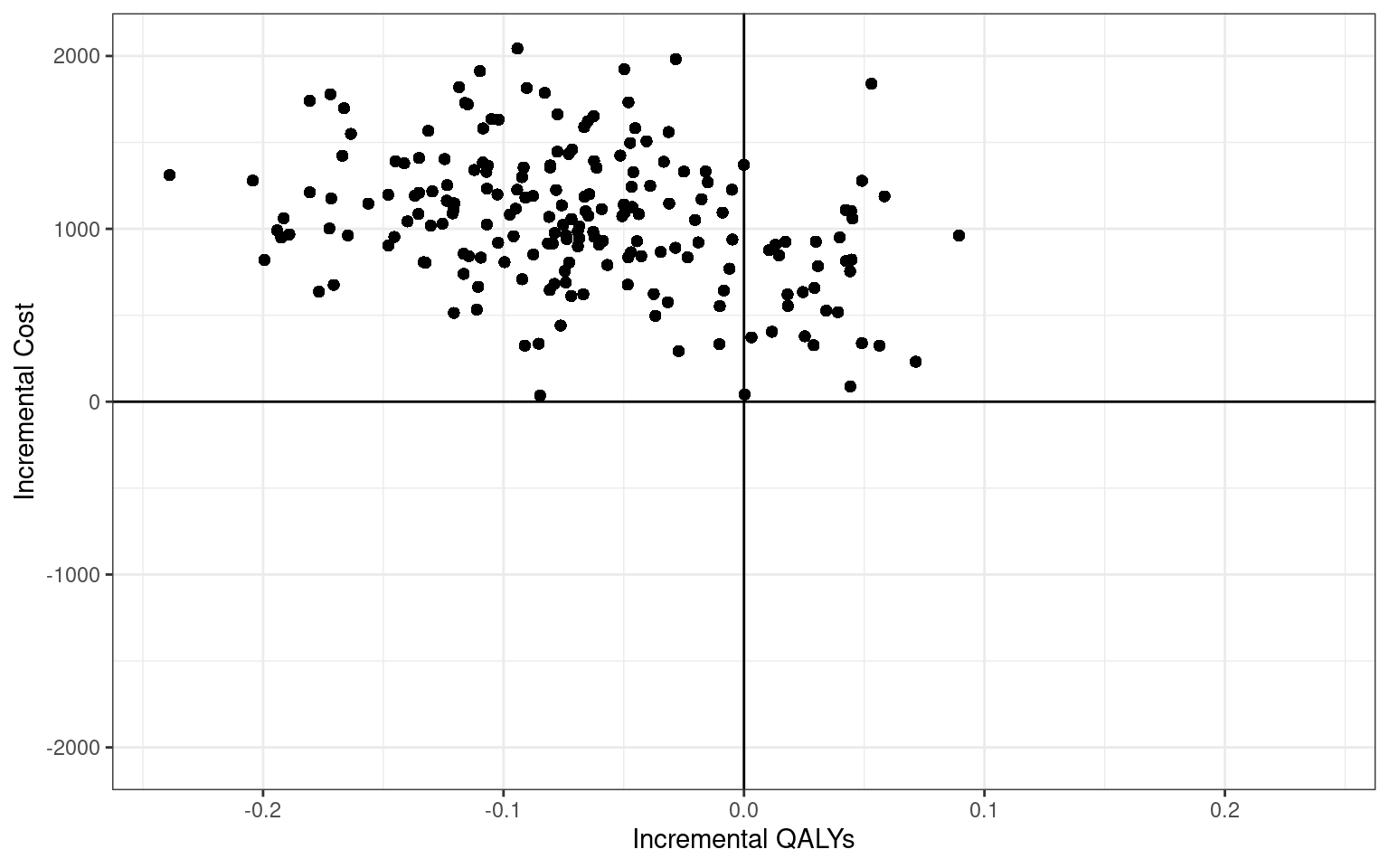
qaly_inc "-0.1 (-0.2; 0)" As the last step, let us plot the bootstrap estimates on the the cost-effectiveness plane.
Note
For the sake of completeness, the bootstrapping in this section was done using only tidyverse commands. However, the reader may wish to explore purpose-built bootstrapping packages, such as boot, which could be useful for simple procedures.
5.3.4 Cost-effectiveness acceptability curve
As it happens, almost all points in the cost-effectiveness plane lie in the north-east quadrant, i.e. the 10TT intervention is both more costly and less effective. Let us quantify this effect by constructing the cost-effectiveness acceptability curve.
We will use the df_boot dataset for this purpose. This can be translated into a probability of being cost-effective for each willingness to pay threshold value
# calculate probability of being cost-effective for each threshold r
# equivalent to the proportion of CE column entries that are equal to 1
# Since CE column entries are either 1 or 0, this is equivalent to the mean
df_ceac <- df_boot %>%
  group_by(r) %>%
  summarise(p_ce = mean(nb>0))
head(df_ceac, 3)
# A tibble: 3 × 2
r p_ce
<dbl> <dbl>
1 0 0
2 100 0
3 200 0And results can be visualised using standard ggplot commands:
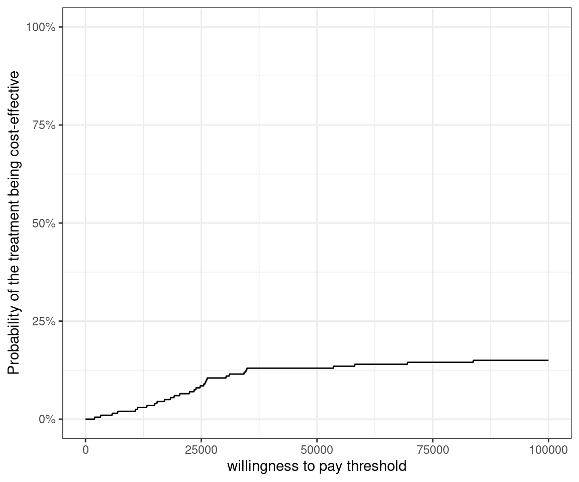
As expected, the probability of the 10TT intervention to be cost-effective is very low at any willingness to pay threshold up to £100,000.
Note
Similarly to the cost-effectiveness plane, the cost-effectiveness acceptability code can also be plotted using the BCEA package, regardless of whether any Bayesian analyses had been done.
5.4 Bayesian analysis
Bayesian approaches to health technology assessment have proven popular (Cooper et al., 2013), in part due to their ability to account for multiple sources of uncertainty (Spiegelhalter and Best, 2003). Baio et al. (2017) also describes the use of Bayesin modelling, including simulation-based Markov Chain Monte Carlo (MCMC) algorithms for HTA. Chapter 4 includes generalised introductions to the use of Bayesian modelling for both point and interval estimation, while Section 4.6 discusses the basic of Bayesian regression modelling.
A key difference between the Bayesian and frequentist approaches is that in the Bayesian approach parameters of interest are treated as random variables, so that interest centres on quantifying their distributions rather than in point estimates and confidence intervals. In fact, the CEAC is an inherently Bayesian concept.
In many cases, the unknown parameter \(\theta\) used to describe the sampling distribution for the data is multi-dimensional, and closed-form expressions for the posterior distribution are not available. Most practical analyses use simulation techniques, such as the Gibbs sampling, a form of Markov Chain Monte Carlo (MCMC), to draw random samples from the posterior distribution of \(\theta\). This works as follows. Suppose \(\boldsymbol\theta\) is \(p\)-dimensional with \(\boldsymbol\theta = (\theta_1,\theta_2,\ldots,\theta_p)\). The Gibbs sampler then samples \(\theta_1\) from the posterior distribution given the data and the current values of \(\theta_2,\ldots,\theta_p\), then samples \(\theta_2\) from its posterior distribution given the data, the newly sampled value of \(\theta_1\) and the current values of \(\theta_3,\ldots,\theta_p\). This continues until all \(p\) elements of \(\boldsymbol\theta\) have been sampled, at which point we have completed one iteration of the Markov Chain. The sampling is then repeated. The stationary distribution of the resulting Markov Chain is the posterior distribution of \(\theta\) given the data. Thus if we run the Markov chain until it has converged, we will be sampling from our desired posterior distribution. Lunn et al. (2013) and Kruschke (2014) contain more details on the process of running MCMC algorithms, with Baio et al. (2017) and Baio (2012) specifically considering applications to economic modelling in HTA.
From the above description, it is apparent that in order to execute a Bayesian analysis, we must specify (a) our prior beliefs about any unknown parameters, (b) the sampling distribution of the data given these parameters, (c) initial values for the Gibbs sampler. We must then run the sampler until convergence, at which point we can take samples from our desired posterior distribution.
NoteImplementing Bayesian analysis
There are several ways to implement MCMC in R. In this chapter we will use the rjags (Plummer, 2024) package to interface with JAGS (Plummer et al., 2003). We use the 10TT dataset to illustrate each of these steps.
Other packages such as R2jags (a different interface to JAGS), or R2OpenBUGS and R2WinBUGS (which can be used to interface with OpenBUGS and WinBUGS) can be used instead. These have very similar syntax, which for all intents and purposes is basically identical.
Even more modern alternatives for Bayesian modelling based on MCMC include Nimble (again with a very similar syntax to JAGS/BUGS) and Stan (with the R interface rstan), which is based on a slightly different MCMC algorithm (Hamiltonian Monte Carlo, which can be more efficient for some types of problems, e.g. survival analysis subject to heavy censoring — see Chapter 7).
5.4.1 Parametric Models
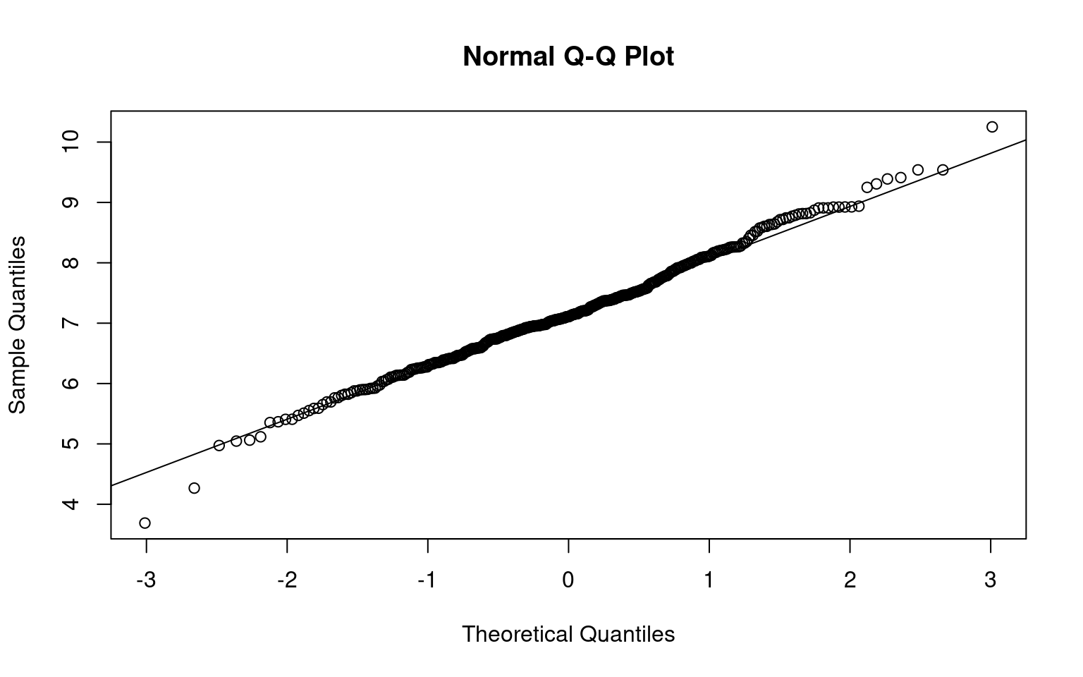
Bayesian analysis requires a fully parametric model for the data, so we begin by examining the distributions of cost and QoL scores (which we assumed are stored in a data object). As noted above, the cost data are right skewed. However, the Normal distribution is still a reasonable approximation to the distribution of the log costs, as can be appreciated in Figure 5.3.

We now consider the QoL scores (in Figure 5.4). The distributions are similar at each time point, so we plot just the first.
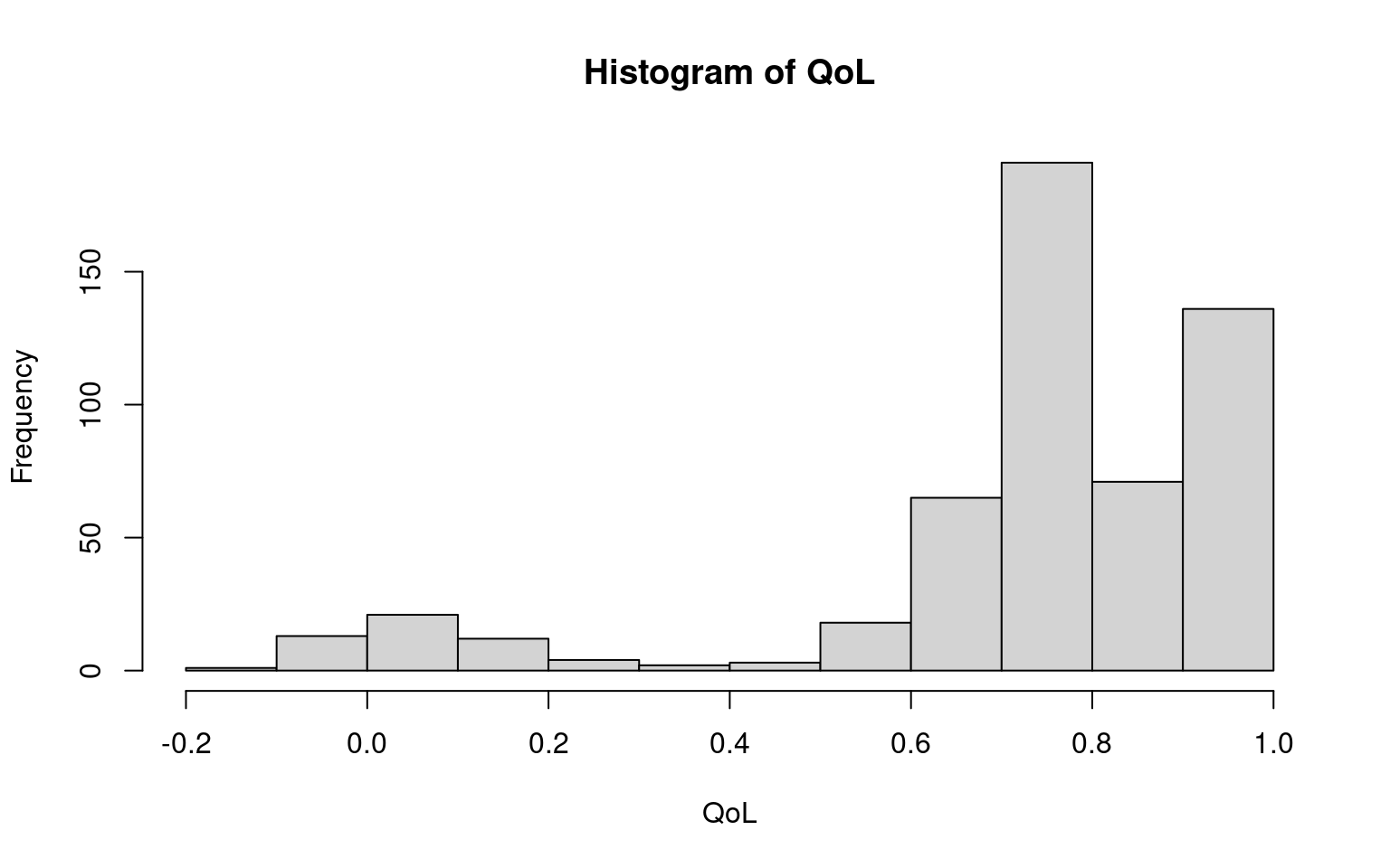

The main departure from Normality is a chunk of observations at the upper bound of 1. If we assume that the quality of life scores follow a truncated Normal, then we have \(\Pr(\mbox{QoL}<x)= \Phi((x-\mu)/\sigma)\) if \(x<1\) and \(\Pr(\mbox{QoL}=1) = 1-\Phi((1-\mu)/\sigma)\). To model this in JAGS we first model the QoL measures as a censored Normal, then back-transform the results to a truncated normal. To do this, we set up a matrix of QoL scores, with one row for each patient and one column for each time point. We then create a matrix recording whether each observation is at the upper bound. The truncated observations are then set to missing. This can be done using the following R code.
QOL <- cbind(
  data$qol_0,data$qol_3,data$qol_6,data$qol_12,data$qol_18,data$qol_24
)
Upper <- matrix(as.numeric(QOL==1),ncol=6)
for(j in 1:6) {
  QOL[QOL[,j]==1,j] <- NA
}
Section 6.7.2 shows modelling based on Gamma models to account for the natural skewness in cost and utility data.
5.4.2 Data preparation
We stratify the data by treatment arm, using the following R code.
Outcomes0 <- cbind(data$log_totalcost,QOL)[data$arm==0,]
Outcomes1 <- cbind(data$log_totalcost,QOL)[data$arm==1,]

Upper0 <- Upper[data$arm==0,]
Upper1 <- Upper[data$arm==1,]
JAGS requires initial values for the truncated observations, which we set up with the code below.
QOL_inits <- array(dim=dim(QOL))
for(j in 1:6) {
  QOL_inits[Upper[,j]==1,j] <- 1 + runif(1,0,1)/10
}
QOL_inits0 <- QOL_inits[data$arm==0,]
QOL_inits1 <- QOL_inits[data$arm==1,]
Outcomes_inits0 <- cbind(rep(NA,nrow(Outcomes0)), QOL_inits0)
Outcomes_inits1 <- cbind(rep(NA,nrow(Outcomes1)), QOL_inits1)
We will implement the Bayesian approach by modelling the log costs and six (untruncated) QoL scores as a multivariate Normal (MVN). We then back-transform to recover the estimated mean costs and mean QoL scores with truncation at 1.
Since the multivariate Normal is not available in the presence of censoring or truncation, we code the multivariate Normal as a series of conditional Normal distributions. Specifically, we begin by specifying a Normal for the log costs, then derive the distribution of the baseline QOL scores conditionally on the log costs, the 3-month QOL scores conditionally on the log costs and baseline QOL scores, and so on. To do this, we use the fact that if two vectors \(Z_1\), \(Z_2\) are jointly multivariate Normal with mean \(\boldsymbol\mu=(\mu_1,\mu_2)\) and variance-covariance matrix \(\boldsymbol\Sigma=\left(\begin{array}{cc} \Sigma_{11} & \Sigma_{12}\\ \Sigma_{21} & \Sigma_{22}\end{array}\right)\), then \(Z_1\mid Z_2 \sim \mbox{Normal}(\mu_1 + \Sigma_{12}\Sigma_{22}^{-1}(Z_2 - \mu_2),\Sigma_{11}-\Sigma_{12}\Sigma_{22}^{-1}\Sigma_{21})\).
In the interests of clarity of the JAGS code this Bayesian analysis does not adjust for age, sex, or QoL at baseline — Section 4.6.2.1 and Section 6.7 add more details on the general process of Bayesian modelling. Note also that, instead of discarding the missing values, we keep them in our analysis and use our Bayesian machinery to estimate their unobserved value — this amounts to assuming a “missing at random” (MAR) mechanism — see a much more detailed account in Chapter 6.
5.4.3 Priors
Bayesian models require specification of priors for unknown parameters. Priors are context-specific; there is no one prior that will work in every example. We therefore offer our rationale for our choices in the anticipation that it is this, rather than the priors themselves, that may be useful to our readers. In this example, we specify vague Normal priors for the means, since these are conjugate priors — see for instance Spiegelhalter et al. (2004), Lunn et al. (2013), Baio (2012), Gelman et al. (2013) or Kruschke (2014) for more discussion on this3.
Measures of QoL are bounded above at 1 and values of 0 represent a QoL equivalent to that of being dead. This trial includes community-dwelling patients and therefore most individuals will have QoL between -1 and 1. A prior belief that the mean QoL score for any timepoint lies between 0 and 1, 95% of the time thus represents a vague prior; this can be made to correspond to a Normal distribution with mean 0.5 and standard deviation 0.25. JAGS specifies Normal distributions in terms of mean and precision (inverse variance), rather than mean and standard deviation; thus these priors appear as Normal(0.5,16) in the JAGS code.
The prior for the log cost is harder to specify as costs have no theoretical upper bound. However, a Normal distribution with mean 10 and standard deviation 10 represents a prior belief that there is a 95% probability that mean costs lie between \(7\times 10^{-5}\) and \(7\times 10^{12}\) GBP and a 50% probability that mean costs lie between \(26\) and \(19,000,000\) GBP, which represents more uncertainty than most users would entertain.
Turning now to the priors for the variance parameters, note that we must specify a distribution for the variance-covariance matrix \(\Sigma\) rather than just the variances of the costs and QoL. We follow Lu and Ades (2009) in using a spherical decomposition \(\Sigma = V^{1/2}LL^\prime V^{1/2}\), where \(V\) is a diagonal matrix of variances and \(L\) is an upper-triangular matrix chosen so \(LL^\prime\) has ones along the diagonal, thus representing a matrix of correlations.
Lu and Ades (2009) show how to select the components of \(L\) such that the correlations of any pair of components are drawn from a Uniform(-1,1) distribution, which is the approach we take here. For the diagonal component, which represents variances, we use a Gamma(1,1) distribution. This represents a prior belief that variances lie within the range of 0.025 to 3.7 with 95% probability, which is clearly vague for the QoL scores. For the costs, we consider the impact on the implied distribution of individual costs of variances of 0.025 and 3.7: fixing the mean of the log-normal at the prior mean of 10, at a variance of 0.025 individual costs would lie in the range of 16,000 to 30,000 with 95% probability, while at a variance of 0.975 individual costs would lie in the range of 510 to 960,000 with 95% probability. This again represents adequate uncertainty.
5.4.4 Runnings JAGS from R
The code for the JAGS model is saved in a separate text file, say jags.script.txt in this example and it is shown below for completeness. The technical details of the JAGS syntax are beyond the scope of this book, but the interested reader is referred to Baio (2012), Kruschke (2014) and Lunn et al. (2013) among others.
model{
  # Arm 0
  for(id in 1:n0){    # Loops over the `n0` patients in arm 0
    Outcomes0[id,1] ~ dnorm(mu_0[1],tau0[1])
    for(col in 2:7){
      Outcomes0[id,col] ~ dnorm(mu_0cond[id,col],tau0cond[col])
    }
    for(int in 2:7){
      # captures whether qol_0 is at the upper bound of 1
      Upper_0[id,int-1] ~ dinterval(Outcomes0[id,int], 1)
    }
  }
  # conditional means and variances
  for(id in 1:n0){
    mu_0cond[id,1] <- mu_0[1]
    mu_0cond[id,2] <- mu_0[2] + (Outcomes0[id,1] - mu_0[1])*
      Sigma_0[2,1]/Sigma_0[1,1]
    for(col in 3:7){
      mu_0cond[id,col] <- mu_0[col] + Sigma_0[col,1:(col-1)]%*%
        inverse(Sigma_0[1:(col-1),1:(col-1)])%*%(
          Outcomes0[id,1:(col-1)] - mu_0[1:(col-1)]
        )
    }
  }
  # conditional *precisions* (to feed to the `dnorm` call above)
  tau0cond[1] <- tau0[1];
  tau0cond[2] <- 1/(Sigma_0[2,2] - Sigma_0[2,1]*Sigma_0[1,2]/Sigma_0[1,1])
  for(col in 3:7){
    tau0cond[col] <- 1/(Sigma_0[col,col] - Sigma_0[col,1:(col-1)]%*%inverse(
      Sigma_0[1:(col-1),1:(col-1)]
    ) %*% Sigma_0[1:(col-1),col])
  }
  # Compute mean QoL
  for(int in 1:6){
    qol_0_mean[int] = 1 - (1-mu_0[int+1])*pnorm(1,mu_0[int+1],tau0[int+1]) -
      sigma0[int+1]*dnorm(1,mu_0[int+1],tau0[int+1])
  }
  # Compute total mean QoL
  qaly_0 <- 0.5*(qol_0_mean[1] + qol_0_mean[2])*3/12 +
    0.5*(qol_0_mean[2] + qol_0_mean[3])*3/12 +
    0.5*(qol_0_mean[3] + qol_0_mean[4])*6/12 +
    0.5*(qol_0_mean[4] + qol_0_mean[5])*(6/12)+
    0.5*(qol_0_mean[5] + qol_0_mean[6])*(6/12)
  # Compute mean total cost
  cost_0 <- exp(mu_0[1] + 0.5*Sigma_0[1,1])
  # Priors
  mu_0[1] ~ dnorm(10,0.01)
  for(i in 2:7){
    mu_0[i] ~ dnorm(0.5,16)
  }
  for(i in 1:7){
    D_0[i,i] ~ dgamma(1,1); sqrt.D0[i,i] <- sqrt(D_0[i,i])
  }
  for(i in 1:6){
    for(j in (i+1):7){
      D_0[i,j] <- 0;  L_0[i,j] <- 0;  sqrt.D0[i,j] <- 0
    }
  }
  L_0[1,1] <- 1;  L_0[2,1] <- cos(phi0[1,2]);  L_0[2,2] <- sin(phi0[1,2])
  D_0[2,1] <- 0;  sqrt.D0[2,1] <- 0
  for(i in 3:7){
    L_0[i,1] <- cos(phi0[i-1,2]);    D_0[i,1] <- 0; sqrt.D0[i,1] <- 0
    for(j in 2:(i-1)){
      D_0[i,j] <- 0
      L_0[i,j] <- prod(sin(phi0[i-1,2:j]))*cos(phi0[i-1,j+1])
      sqrt.D0[i,j] <- 0
    }
    L_0[i,i] <- prod(sin(phi0[i-1,2:i]))
  }
  for(i in 1:6){
    for(j in 1:7){
      phi0[i,j] ~ dunif(0,3.1415)
    }
  }
  Sigma_0 <- sqrt.D0%*%L_0%*%t(L_0)%*%sqrt.D0
  # Compute variance matrix
  for(i in 1:7){
    sigma0[i] <- sqrt(Sigma_0[i,i]);    tau0[i] <- 1/Sigma_0[i,i]
  }
  R_0 <- L_0%*%t(L_0)

  # Now repeat for Arm 1 (change suffix `_0` to `_1`)
  ...

  # Then compute incremental costs and effects
  qaly_inc <- qaly_1 - qaly_0;      cost_inc <- cost_1 - cost_0
}
Before running the model we set initial values using jags.inits, and specify the data using jags.data. The model is set up and initalized using jags.model, then updates are run using the rjags function update. We begin with a burn-in of 50,000 iterations.
# Sets the initial values for the model parameters
jags.inits <- list(Outcomes0=Outcomes_inits0,Outcomes1=Outcomes_inits1)
# Defines the data as a named 'list'
jags.data <- list(
  Outcomes0=Outcomes0,Outcomes1=Outcomes1,n0=nrow(Outcomes0),
  n1=nrow(Outcomes1),Upper_0=Upper0,Upper_1=Upper1
)
# Runs JAGS in the background
model <- jags.model(
  "jags.script.txt", data=jags.data, inits=jags.inits, n.chains=1
)
# Updates the model with 50000 iterations
update(model, n.iter=50000)
5.4.5 Checking convergence
Before looking at any results we need to check whether there is any evidence of non-convergence. This needs to be done carefully as successive samples from the Markov Chain are correlated. A number of diagnostics exist, each of which examines a different aspect of non-convergence. Since no diagnostic can prove that convergence has occurred, but rather looks for evidence of non-convergence, it is recommended to use a number of diagnostics (Cowles and Carlin, 1996). Here we use the Geweke (Geweke, 1992), Raftery-Lewis (Raftery and Lewis, 1992) and Heidelberger-Welch (Heidelberger and Welch, 1983) tests.
The Geweke diagnostic (geweke.diag) examines whether the mean of the draws from the first frac1 iterations of the chain is the same as the mean from the last frac2 draws from the chain; frac1 and frac2 are specified by the user and default to the first 10% and the last 50%. The Raftery-Lewis diagnostic (raftery.diag) assesses whether the quantile q can be estimated to a precision of r with confidence p, and thus assesses both whether the burn-in is sufficient and also whether the post burn-in run length is sufficient for the desired Monte Carlo error. The Heidelberger-Welch diagnostic (heidel.diag) examines stationarity of the sample mean as well as the accuracy of the estimate of the mean relative to the width of its confidence interval.
Specifically, the diagnostic first uses a Cramer-von-Mises statistic to test whether the mean of the first 10% of the iterations is equal to the mean of the whole run; if this is rejected then the first 10% are discarded and the test is repeated on the next 10%. This is repeated until either the hypothesis of equality is not rejected (in which case the test is based and the portion of the chain to be discarded is indicated through “start iteration” on the output), or until half the iterations have been discarded, in which case the test marked as failed. The halfwidth test finds a 95% confidence interval for the mean based on the portion of the chain that passed the test, then computes the ratio of half the width of this confidence interval to the estimated mean. The test is marked as passed if this ratio is smaller than a user-specified value eps (defaults to 0.1).
We draw 1000 samples from the chain using coda.samples. The arguments in variable names specify which nodes should be saved in the object samples. When there are a large number of parameters it can be helpful to monitor a subset to avoid high type I error error rates, and so we monitor the key parameters of interest as well as a few of the variance-covariance parameters.
# Saves the results of 1000 iterations in an object 'samples'
samples <- coda.samples(
  model,variable.names=c(
    "phi0[3,1]","phi0[6,4]","phi1[2,1]","phi1[4,2]","sigma0[1]","sigma0[4]",
    "sigma1[2]","sigma1[7]","cost_0","qaly_0","cost_1","qaly_1","qaly_inc",
    "cost_inc"
  ),n.iter=1000
)
# Stores the MCMC samples in a R dataset
dput(samples,"data/samples0.Rdata")
Using the simulations, we then run the various diagnostics using the following commands from the R package coda.
# Geweke diagnostics
coda::geweke.diag(samples,frac1=0.1,frac2=0.5)

# Raftery-Lewis Diagnostic, 2.5th and 97.5 percentile, respectively
coda::raftery.diag(samples,r=1,q=0.025)
coda::raftery.diag(samples,r=1,q=0.975)

# Heidelberger-Welch Diagnostic
coda::heidel.diag(samples)
Careful analysis of these diagnostics, which is presented in more details in the online version of this book (available at the website https://gianluca.statistica.it/books/rhta) shows no evidence of non-convergence and also suggest that the Monte Carlo error is small enough to report results to the nearest whole number. The autocorrelation plots suggest that autocorrelation is close to zero at lags of 20 or more.
5.4.6 Bayesian Results
We are now in a position to examine the posterior distributions of our quantities of interest. We run some more updates, thinning the chain to one in every 20 samples so as to achieve minimal autocorrelation in our sampled values. This will be important for the plots that follow.
# Run the model for 4000 more iterations, with thinning
samples2 <- coda.samples(
  model, variable.names=c(
    "cost_0","qaly_0","cost_1","qaly_1","qaly_inc","cost_inc"
  ),
  n.iter=4000,thin=20
)
# Show some summary statistics
summary(samples2)
Iterations = 55020:59000
Thinning interval = 20
Number of chains = 1
Sample size per chain = 200

1. Empirical mean and standard deviation for each variable,
   plus standard error of the mean:

               Mean        SD  Naive SE Time-series SE
cost_0   1863.01667 128.83719 9.110e+00      9.110e+00
cost_1   2421.75535 249.69898 1.766e+01      1.766e+01
cost_inc  558.73868 282.63481 1.999e+01      1.999e+01
qaly_0      1.07647   0.01235 8.734e-04      8.772e-04
qaly_1      1.03208   0.01514 1.070e-03      1.070e-03
qaly_inc   -0.04439   0.02009 1.421e-03      1.723e-03

2. Quantiles for each variable:

               2.5%        25%        50%        75%      97.5%
cost_0   1618.30210 1764.23153 1861.16193 1952.66542  2.104e+03
cost_1   1990.39832 2236.66066 2403.86531 2558.22854  2.963e+03
cost_inc   54.80136  371.99113  540.65964  749.71963  1.135e+03
qaly_0      1.05263    1.07023    1.07567    1.08505  1.101e+00
qaly_1      1.00031    1.02127    1.03355    1.04231  1.060e+00
qaly_inc   -0.08088   -0.05941   -0.04377   -0.03114 -4.987e-03
# And the actual first few simulated values for each model parameter
samples2[[1]][1:6,] cost_0 cost_1 cost_inc qaly_0 qaly_1 qaly_inc
[1,] 2005.810 2223.245 217.4350 1.071844 1.046836 -0.02500764
[2,] 1719.746 2153.096 433.3504 1.072200 1.031142 -0.04105770
[3,] 1889.048 2369.015 479.9673 1.073941 1.038927 -0.03501439
[4,] 2067.184 2455.420 388.2356 1.071040 1.030837 -0.04020262
[5,] 1688.237 2573.311 885.0739 1.074760 1.016438 -0.05832170
[6,] 1832.070 2683.311 851.2417 1.087331 1.045238 -0.04209312These results indicate that the incremental cost has posterior mean 560 GBP (cfr the statistics for the node cost_inc in the “empirical mean” table above), with 95% interval (see Section 4.5.1) of 55 to 1100 GBP, as can be seen from the node cost_inc in the “quantiles” block above. Similarly, the incremental QALYs (qaly_inc) have posterior mean -0.04 with 95% interval of -0.08 to -0.005.
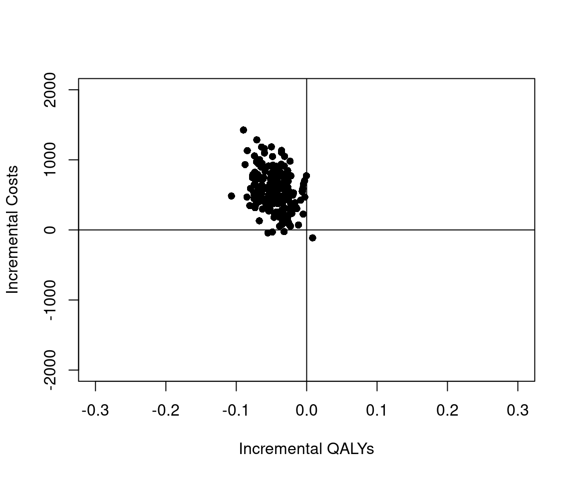
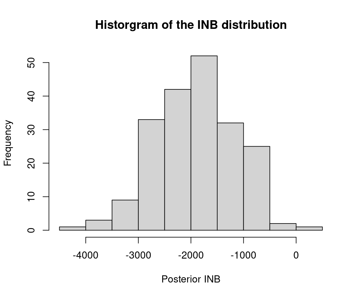
Furthermore, we have a sample of 200 roughly independent draws from the joint posterior distribution of the incremental costs and incremental QALYs, which we can visualize on the cost-effectiveness plane in Figure 5.5 (a), indicating that, essentially, irrespective of the willingness to pay threshold chosen, the proportion of points indicating that the new treatment is cost-effective is close to 0 (in line with the analysis presented in Section 5.3.4). This is also confirmed by the plot in Figure 5.5 (b), showing the posterior distribution for the Incremental Net Benefit at a set willingness to pay threshold of 30,000 GBP/QALY.
These results are qualitatively similar to the frequentist results, but the numbers themselves differ. There are two reasons for this. Firstly, the Bayesian analyses have made modelling assumptions around the distributions of the patient-level costs and QALYs. We note that many HTA agencies recommend examining sensitivity to modeling assumptions NICE (2013) and so it is in fact a strength to have made different assumptions in the Bayesian and frequentist analyses. Secondly, while the frequentist analyses used complete cases only, the Bayesian analyses have specified a (simplified) mechanism to estimate the missing data. Chapter 6 will delve into the handling of missing data in more detail.
The dataset produced here is similar to the original trial dataset. The extra manipulation here was not necessary, but provides an example of how the datasets can be merged when patient characteristics, costs and quality of life data are provided separately, which is typically the case.↩︎
The number of 200 sampling loops was chosen as a compromise between the speed of the execution of the illustrative code and robustness of the results. Typically, 1,000 or more bootstrap samples are required.↩︎
In a nutshell, a conjugate prior is such that the posterior distribution is in the same parametric family as the prior, which makes computations much easier.↩︎